Thursday, October 29, 2009
Model Making
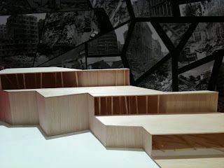
The theme of the collage and model is destruction. The images of the collage shows how the building was destruted by the earthquake. The model are cut into parts and the interior of it is all destruted.
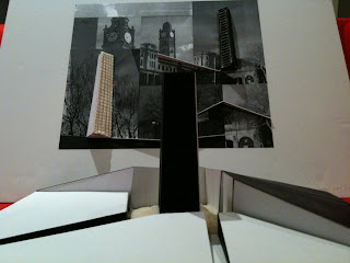
The clock tower in central train station is selected as my theme in this worlshop. In the model, is shows that the tower looks black in daytime when the sun shine at the back, and the tower looks white at night time since the light shines on it.
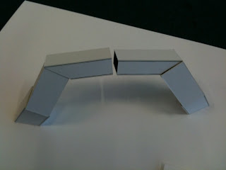
The theme of this model is fold and slice. The form of the model relates to the theme directly.
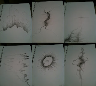
This set of drawings has a sense of unity since the use of line shape and line weight. The unity of them makes the drawings look as a whole.
Fluid of Thought
Using perspective in this drawing show how the building forms the public space in its front. the darker part represents where the eyes are looking at.
I think the best thing in this dawing is the layout. It shows the surrounding evironment of the building.
Again, dark space shows where my eyes go. Its creats a focal point in this drawing.
Atlas of Colour
In this image, the tunnel shows the different layers are overlapping, which expresses a sense of movement. the colour and shapes of the layers helps to show the movement more detailly.
The top view of the booklet shows how it fold. The selection of the colour for the pages are all from the cover page, which can be seen as a unity of the whole book.
This side view of the booklet shows how the tunnel go through the whole thing; and every page has its own theme colour, which relate to the cover page.
This collage is divided into three parts which are sky, building and ground. The colour and shape of the three parts has relationship with the background image. Moverover, photoshop is used on creating the interior of the building, which turns the 2D section into 3D space.
In this face map, three sets of colour are chosen, which shows the shape of the face and how it extend further.
Subscribe to:
Posts (Atom)